Grounds Logo Exploration

Hello! I’ve been working on a few iterations of the logo, and would love some feedback from the community!

This was an earlier exploration where I played with the idea of two cups and different color palettes:

With some internal feedback, I closed in on the singular cup so that it’s more similar to the nouns logo:

And then, narrowed it down to a couple of variations of palette, one a little bit warmer than the other:

What do you think?

6 Likes

I love them all in the 2 last boards. I think I have a slight preference for the 2-layer versions, especially #1 and #3, just because they’re simpler.

If I had to choose one of the last board, it would be the 2nd one.

Great work! <3

2 Likes

I definitely like the left one More bold, like my coffee

2 Likes

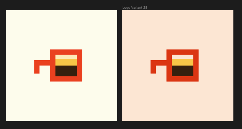
not sure if just my eyes/screen but looks to me like the left image has its top layer more influenced more by the background color while the right image is more distinctly white?

feels sorta like I prefer having a background gap between the coffee and the top of the cup reflecting the background color and so prefer left. Like the cup isn’t 100% full

1 Like

Yeah, I noticed that too, especially when they are put side-by-side like that.
I agree that the top of the foam on the coffee should perhaps be a distinct colour from the background.

@cedricwaxwing, I think I like the warmer one (on the right)

1 Like